■ CASE STUDY · WEBSITE
Novi 25. maj
How we presented a residential complex through the experience of future living, not through floor plans and specs.
- CLIENT
- Novi 25. maj ↗
- INDUSTRY
- Residential construction
- SERVICES
- UX/UI design · DevelopmentListings presentation · Interactive map
- OUR ROLE
- Website design and development
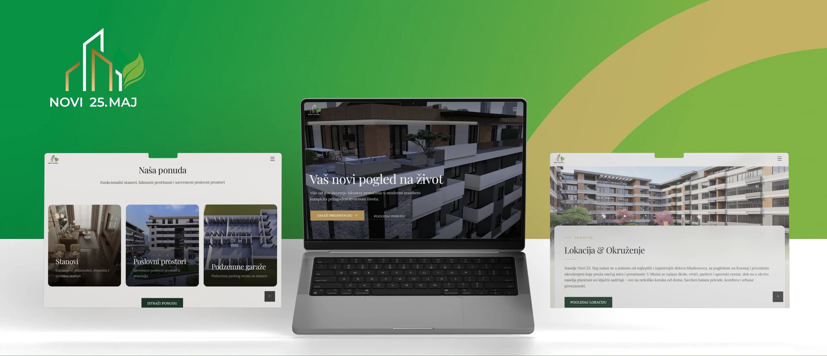
Novi 25. maj is a modern residential complex in Mladenovac, spanning several buildings and a large number of apartments of different layouts.
On projects like this, a website can easily end up as nothing more than a digital catalog: building renders, a table of units, floor areas and a contact form. But the decision to buy an apartment is never made on square meters alone.
So the goal was to build a digital presentation that gives the visitor everything they need to decide, while also getting across what living in the project actually feels like.
01
Challenge
While researching a property, a prospective buyer goes through a large amount of information: location, unit availability, layout, floor area, room arrangement, the look of the complex and its surroundings.
Our job was to organize all of that information so the site stayed simple and easy to scan, without reducing the project to a technical spec sheet of apartments.
A particular challenge was drawing a clear line between simply presenting a property and presenting the value of actually living in it.
■ DELIVERED
What went into the delivery.
01
Complex and architecture presentation
02
Overview of buildings and available units
03
Detailed unit and floor-area breakdown
04
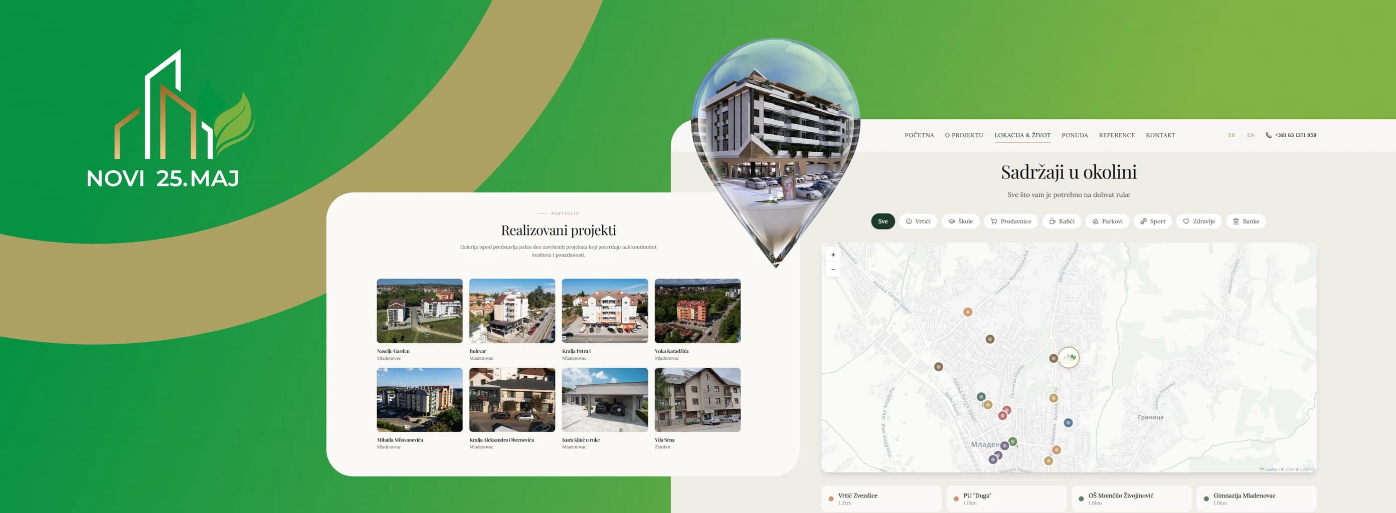
Location and neighborhood content
05
Inquiry and contact flow
02
Solution
We designed the site to gradually guide the visitor from getting to know the complex to the specific apartment that fits their needs.
Instead of presenting all the information at once, we built a clear content hierarchy: the visitor first gets to know the project, its architecture, location and surroundings, then moves on to the buildings and available apartments.
That way we connected the rational part of the decision — floor area, layout and features — with the visual and emotional part that brings everyday life in the complex closer to the visitor.
02.1
The complex before the individual apartment
Before a visitor gets to choosing a specific unit, it was important for them to understand the bigger picture.
That is why dedicated space went to presenting the complex itself: its architecture, shared spaces and surroundings.
The goal was not just to show where an apartment sits, but to let the visitor picture how that space works as a place for everyday life.
02.2
A clearer path to the right apartment
On a project with this many units, one of the key UX challenges is letting the visitor get to the information they actually care about, quickly.
So we organized the site's structure so that browsing the different buildings and apartments feels intuitive, with the relevant data available without digging through a large number of pages.
Information about layout, floor area and other unit features is laid out so the visitor can easily narrow down their choice and move on to a concrete inquiry.
02.3
Location as part of the product
Buying a property is never just about the apartment — it is also about its surroundings.
That is why we did not treat location as just another line with an address, but as an important part of presenting the project.
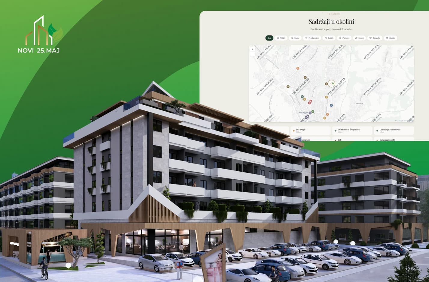
Nearby amenities, connectivity and everyday life in the area are presented as part of the complex's overall value, giving the visitor broader context for their decision.
02.4
A visual identity that gives the project room
The site's design is built so the architecture and visuals stay front and center.
A clean structure, a clear type hierarchy and enough breathing room between sections let the renders and photos carry the project's character, while the interface itself stays unobtrusive and easy to use.
We paid particular attention to responsive layout and performance, so browsing the project and its apartments is just as simple on a phone — the device many prospective buyers first land on the site from.
02.5
From browsing the project to a real inquiry
Every part of the visitor's journey leads to a clear next step.
Once a visitor finds an apartment or a part of the project they are interested in, they can move straight to contact and send an inquiry, without breaking their flow or hunting for more information elsewhere.
That way the site does not just work as a presentation of the project — it becomes an active part of the sales process.
03
Result
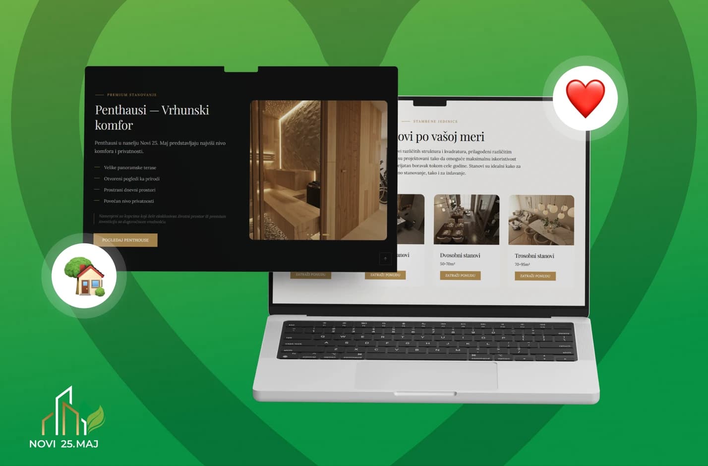
Novi 25. maj got a digital platform that brings together, in one place, the presentation of the complex, its living environment and the actual apartment listings.
Instead of a site that only gives a prospective buyer technical information, we built an experience that helps them first understand the project, then find the right apartment, and finally take the next step with no friction.
Because when it comes to buying a home, the question is never just how many square meters you get, but what living in them will actually be like.
■ IN NUMBERS
20+
Years of developer experience
3
Listing categories: apartments, units, garages
8
Categories on the neighborhood map