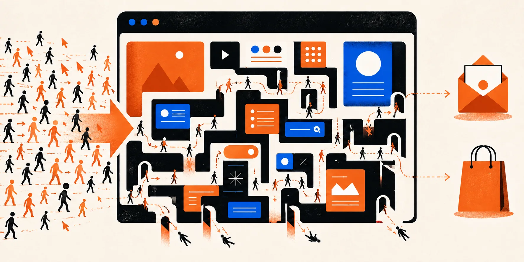
A visit to a site is not the same thing as a potential client.
You can have thousands of visits a month, but if the wrong people are arriving, if they do not grasp what you offer quickly enough, or if they see no reason to choose you in particular, the number of visits will not change the business result much.
So before you put more money into SEO, Google Ads or social media, it is worth checking what happens once a user has already arrived on the site.
How many visits does a site need before inquiries start coming in?
There is no universal number. A hundred of the right visitors can be worth more than ten thousand people with no intention of buying what you offer.
If you sell a specific B2B service, you may not need enormous traffic. What matters far more is that the people arriving have a problem you can solve and enough information to make a decision.
So the question is not only:
“How many people come to the site?”
but:
“Who comes, and what do those people do once they arrive?”
The first problem: the wrong people are arriving
Heavy organic traffic looks good in a report, but it means little if most of the visitors can never become your client.
Say a company that builds business software draws a large number of visits with an article titled “What is a CRM?”.
That can be useful content, but among the readers will be students, people simply looking the term up, employees of other companies and users with no intention whatsoever of buying software.
A far more valuable search can be:
“When is it time for a company to move from Excel to a CRM?”
The search volume may be lower, but the user's intent is completely different.
Which is why good SEO and GEO should not chase traffic alone. They should attract people with the right problem at the right moment.
Does a user immediately understand what you do?
A user should not have to study your homepage to work out what you sell.
If after a few seconds it is not clear:
- what you do
- who you help
- which problem you solve
- what they should do next
there is a good chance they will leave.
Headlines along the lines of:
“Building the future together.”
can sound nice, but on their own they say almost nothing.
If you build websites, apps and business software, that should be stated clearly somewhere very high on the page.
A brand message can have character, but clarity should not be sacrificed to creativity.
Does a user know why they should choose you specifically?
“Quality”, “innovation”, “commitment” and “an individual approach” are not enough.
Almost every company claims the same thing on its site.
A potential client wants more specific answers:
Have you solved a similar problem before?
What kind of companies do you work with?
What does your process look like?
Who will be working on my project?
Which technology do you use, and why?
What did you achieve on previous projects?
That is why references and case studies are not decoration on a site. They are the proof that you can actually do what you claim.
Why do case studies matter for conversion?
A row of logos shows that you have worked with well-known companies.
A case study shows what you actually did for them.
That is a big difference.
A good case study should explain the problem the client came with, why the existing solution was not enough, how you approached the project, what you built and what result was achieved.
A potential client then does not have to imagine whether you could solve their problem.
They can see that you have already done something similar.
This matters for GEO too, because AI systems get a far more concrete signal about what a company genuinely has experience in, instead of only a general claim that it provides a given service.
Does your site have a clear next step?
Suppose a user has read everything and is interested.
What should they do now?
If they have to hunt for a contact page, copy an email address or work out who to reach, you have put an unnecessary obstacle in their way.
A good CTA does not have to be aggressive.
It can simply say:
Book a call.
Send us your project.
Request an estimate.
See how we work.
What matters is that a logical next step exists. More importantly, not every user is ready to book a meeting straight away. Some will first want to look at projects, read a case study or explore the services.
So a site has to support both the people who are ready to get in touch and those still deciding whether they trust you.
Are you asking for too much information too early?
A contact form with ten required fields may be convenient for your sales team, but it often is not for the user.
If someone has only just started thinking about a project, they may not yet have a defined budget, deadline, technology or detailed specification. That does not make them a poor prospect. Ask only for the information you genuinely need in order to start a conversation.
Everything else can come later.
Does your site give enough reasons to trust you?
Before someone hands over their details or commits a serious budget, they are trying to reduce risk.
So they look for signals of trust.
Those can be:
- specific projects
- well-known clients
- results
- client testimonials
- the people behind the company
- a clear way of working
- services explained in detail
- quality content
- an active company with a clear identity
Picture the difference between two sites.
The first says:
“We are a leading digital agency delivering innovative solutions.”
The second shows you six projects, who worked on them, which problem was solved and what the result was.
Which one would you send an inquiry to?
Is the problem the mobile version of the site?
It can be.
If a user has to zoom in, wait a long time for a page to load, close a popup covering half the screen, or cannot fill in a form properly from a phone, they will not care much how nice the desktop version looks.
The mobile experience today is not an extra version of a site.
It is often the main experience of the site.
So it is worth checking not only whether the site is “responsive”, but how easy it is to do the most important things from a smaller screen.
Can a slow site reduce inquiries and sales?
Yes.
Speed is not only a technical SEO factor.
It is part of the user experience.
If a page takes a long time to load the hero, the products or the next step, a user can leave before they even see the offer.
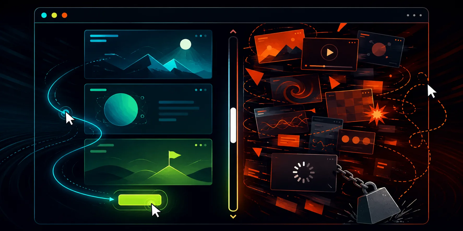
It is especially problematic when a site looks impressive, but a large volume of animation, video or scripts makes it harder to use.
A visual effect is worth having only up to the point where it starts working against the page's business goal.
Can a site look great and still not sell?
Absolutely.
A beautiful site and a site that sells well are not necessarily the same thing.
You can have excellent typography, animation and photography, and a user can still not know:
what you offer, how relevant you are to their problem and what they should do next.
Design should support the message, not replace it.
When a user notices the design but does not remember what the company does, something is probably not set up right.
Are you offering too many things at once?
Another frequent problem is trying to put everything on the homepage.
Ten services.
Five products.
Three target audiences.
Seven CTA buttons.
Fifteen messages, all of them “the most important”.
The result is that a user does not know where to look first. A good page has a hierarchy. The most important message comes first, then the proof, then the details and the next step. You do not have to tell a user everything you know in the first thirty seconds. You have to help them find what they came for.
What if people read the blog but never reach your services?
This matters especially in an SEO and GEO strategy.
A blog can bring a large number of people to a site while almost none of them ever open a service page.
The problem then is not necessarily the content. The problem can be that there is no link between the information the user read and the solution you offer.
If someone is reading:
“What does building a website cost?”
it is logical to also offer them:
“See how we do website development.”
If they are reading:
“When is Excel no longer enough?”
the logical next step can be:
“See how we build custom business software.”
Internal links are therefore not only an SEO technique.
They help a user get from the answer to a question to a concrete solution.
Maybe the problem is not the site at all
This needs saying. If you have traffic but no sales, that does not automatically mean you need a new site. The problem may be the offer. Prices may be significantly above what the market expects. Advertising may be attracting the wrong audience. The product may not have a clear enough advantage. The sales process after an inquiry may not be working.
The site is part of the system, not the whole system.
So the analysis should start from the data, not from the assumption that “the design is bad”.
How do you find out where users drop off?
Start with the data you already have.
Look at which pages get the most visits, where users come from, how long they spend on those pages and what they do next.
It is particularly useful to track:
- clicks on CTA buttons
- forms started and forms completed
- the pages users most often leave from
- mobile and desktop users separately
- traffic sources
- landing pages
- conversions per page
- user behavior through heatmap and session recording tools
Knowing that a site gets 20,000 visits a month is not especially useful on its own.
It is far more useful to know:
“This page brings in the right people, but 90% of them never see our offer.”
There you already have a problem that can actually be worked on.
Can more traffic solve the problem?
If the existing traffic is good quality and conversion works, more visits can bring more results.
If conversion is not working, extra traffic often only means more people arriving on a page that does not convince them to do anything.
So there is little sense in pouring more budget into bringing users in before you check what is happening to the ones you already have.
How do you increase inquiries from an existing site?
There is no single change that fixes everything, but most often several things need looking at together.
Is the offer clear?
Do the pages answer the questions a buyer has before deciding?
Are you showing concrete results?
Does the CTA match the stage the user is at?
Is getting in touch simple?
Does the mobile version work well?
Does a user have enough reason to trust you?
And most importantly:
does the site lead a user from the problem they came with to the solution you offer?
If it does not, that is usually where the biggest room for improvement lies.
How do I know whether I need optimization or a completely new site?
If the technology is sound, pages can be changed and the problem is mostly the content, the structure or the user experience, it is often better to optimize the existing site first.
If every serious change takes a workaround, the system is slow, administration is complicated or the existing technology blocks the changes you need, then a new site is worth considering.
Before deciding, you should therefore analyze both the business and the technical problem.
A redesign is not the answer to every conversion problem.
In summary, why does a site get traffic but no inquiries or sales?
Most often because the wrong audience is arriving, the offer is not clear enough, the user lacks a reason to trust you, or there is no simple enough next step.
The problem can also lie in speed, the mobile experience, the structure, the content or the offer itself.
So the first step is not necessarily bringing in even more visitors.
First check what is stopping the visitors you already have from becoming clients.
Getting traffic but not the result you expect?
Before you decide you need more advertising or a completely new site, it is worth establishing where users drop off and why.
Sometimes changing the content, the structure or the user journey is enough. Sometimes the existing site has become the limit and you have to start over.
Only once you know where the problem is can you choose a solution that makes sense.
Take a look at how we approach website development and redesign, or book a call with our team.