Maybe the delivery price was nowhere to be found. Maybe the page took forever to load, or the site asked you five times to join a newsletter. Whatever the reason, you probably did not write to the owner to explain what to fix. You just left.
That is the problem with a bad user experience. Most people have neither the time nor the wish to report everything that bothers them. And site owners often do not see how much small details affect a visitor's choice to stay, buy something or give up.
Let us look at some of the most common situations.
Pop-ups at every step
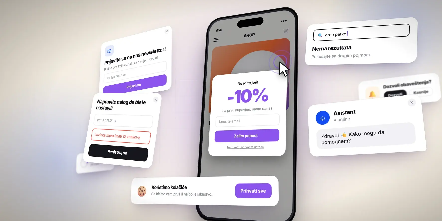
You have just opened the site, and something already asks you to join the newsletter. You close that window, and a second one appears with a 10% discount. You close that one too, and a chatbot opens in the bottom corner to ask how it can help.
All of this happens before you even see what you came for.
Pop-ups have a purpose, and when you use them well, they bring good results. But when they appear too early or too often, they do the opposite. On a phone it is worse, because one such window covers almost the whole screen.
There is no need to offer a visitor five different things in the first ten seconds. Let people look at the content first. Show extra offers later, at the moment when they make sense.
Search that does not understand what you want
Imagine you look for black sneakers and type “blak sneakers” by mistake. The site does not offer matching products or even suggest a correction. It tells you there are no results.
A similar problem appears when search only knows exact product names. The visitor then has to know how an item is listed in the catalog to find it at all.
Filters are often just as frustrating. You pick a size, a color, a price range and a few more options. You open a product you like and go back. Every filter is gone, and you look at several hundred products again.
Search and filters exist to shorten the time it takes to find the right product. If the visitor has to repeat the same steps every time, they lose their purpose.
So search has to catch at least the usual typos and the different names people use for a product. Chosen filters have to stay in place while the visitor browses.
A site that barely works on a phone
Today everyone expects a site to work on mobile devices. Still, a site that opens on a phone and a site that people can actually use on a phone are two very different things.
Buttons are often so small that they are hard to hit. The text is too small to read. The menu is so complex that the visitor cannot find the page they want. Sometimes one window that does not close is enough to spoil the whole visit.
These problems often go unnoticed. During development, people mostly look at the site on a large monitor, where everything looks fine.
So it is not enough to shrink the browser window and check that the elements line up. Take a phone and actually go through the site. Find a product, fill in a form, open the menu and try to finish a purchase. Only then do you see how simple the experience really is.
An account before the purchase
You found the product, the price suits you and you want to finish the purchase. But first you have to create an account.
Suddenly you face a form with a pile of fields, password rules and an email confirmation. Half of the questions have little to do with what you wanted to buy.
Accounts are not bad in themselves. Regular customers like to have saved details, a list of past orders and a way to track a delivery. But a first-time visitor does not want another account just to order one item.
That is why checkout without a required account is often the more pleasant choice. The visitor completes the order, and the site offers an account afterwards to those who want to save their details for next time.
The same goes for forms. The fewer needless fields there are, the smaller the chance that someone gives up halfway.
Costs you see only at the end
A product costs 2,990 dinars. You add it to the cart, enter your details and reach the last step. There you see a total of 3,640 dinars.
Delivery costs extra, and you did not notice that earlier, or the site did not show it clearly.
Delivery costs money, and so do the box and some extra services. Nobody disputes that. The problem starts when the customer learns about them only after almost the whole checkout.
Delivery times work the same way. If the product is not in stock or takes ten days to arrive, show that early. Do not let the customer discover it several steps later.
Clear prices, delivery costs and stock information are not the most attractive part of a design. For customers, they often matter more than extra visual effects.
Buttons and forms that do not behave as you expect
You click the “Send inquiry” button and nothing happens.
You click again, just in case, and still see no confirmation. Now you do not know if the message went out twice, not at all, or if you just have to wait.
It is one of those problems that seem harmless until you sit on the other side of the screen.
At every moment, a visitor needs to know what happened after an action. If the form went through, they get a confirmation. If they entered something wrong, the site marks clearly what to fix.
Forms that erase every entry after an error are especially annoying. Few people enjoy filling in ten fields again because they missed one digit in a phone number.
Regular tests of forms, buttons and other key functions prevent many of these situations.
Information nobody can find
- How much does the service cost?
- Where are you located?
- How can I contact you?
- Is the product in stock?
These are some of the basic questions people bring to a website. Yet sometimes the answers take several minutes of digging through different pages.
Some sites have an interesting design and unusual navigation, but in the effort to look different, they forget about practical use. Section names are unclear and contact details are hidden. Service descriptions are so general that, after reading them, the visitor still does not know what the company offers.
Good design does not have to be boring to work well. A site can offer an interesting visual experience and still keep basic information easy to find.
The simplest test is this: ask someone who has never seen your site to find a specific piece of information. If they need several tries, it is time to rethink how you organize the content.
Slow loading and animations that last too long
Animations make a site more interesting, help present a product and leave a strong first impression. But when there are too many, the visitor stops enjoying them and starts to wait for them to end.
On some sites almost every section needs extra loading, and scrolling triggers so many effects that the content is hard to browse. Sometimes elements move while the page loads, and the visitor clicks the wrong spot by accident.
Oversized photos, unoptimized videos and too many scripts also slow a page down.
Of course, nobody has to give up animations or a more complex design. The key is to find the right measure. Effects need a purpose, and a site must not trade speed and ease of use for looks.
Have you ever used your own site as a first-time visitor?
When you work on one site for a long time, you get used to its structure. You know where everything is, how each part works and in what order to do each task.
That is why it is easy to miss problems that a new visitor sees at once.
One simple way to find them is to ask someone who does not know the site to do a few tasks. For example, find a specific product, check the delivery price or send an inquiry. Do not tell them where to click. Watch what they do and where they get stuck.
Analytics data helps too. If many people leave the cart at the same step or often exit a certain page, check closely what happens there. The number alone does not always tell you why people leave. It shows you where to look.
Not every problem needs a full redesign. Sometimes it is enough to simplify a form, change the order of information or fix a function that does not work. Sometimes bigger changes are necessary.
See your site through the eyes of the people who have to use it, and not only through the eyes of those who built it or own it.
In the end, a visitor will probably never notice how much time you spent on an animation or a design detail. But they will notice very fast if they cannot find what they need.